
Regularity, cohesion, balance
07 Jul 2009I was going through my digital camera today when I came across this:
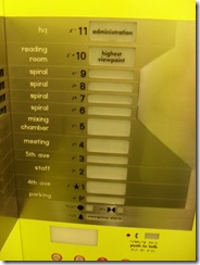
I took this picture in the Seattle public library elevator. It’s a great building, with lots of unusual features.
Why did I take it? Because I thought the design was interesting. The typical elevator button panels has a series of buttons, each of them the same size, ordered with the corresponding floor elevation. This panel has buttons of various sizes, and given what I saw in the building, I guess the size corresponds to the frequentation of each floor, or, if you prefer, the relative likelihood that you want to go to each floor.
In my opinion, there are some flaws in the design (for instance, the buttons are very far from the labels saying what is on the floor, which slows down figuring out which button you really want to push), but I thought the idea of various button sizes was smart, and bizarrely under-utilized in computer user interfaces. If you are going to expose different functionalities to your user, chances are, some will be used more often than others, and giving them a larger button should make the user’s navigation easier.
I found an example of this on Netflix’s website, for instance:

Note how the 2 right-most elements of the tab are smaller than the rest? So why is this design style rare? I guess it has to do with the fact that regularity looks good, without much effort. Give your buttons the same size and font, and everything looks organized, and easy on the eye. Once you start playing with elements of various sizes, it is much harder to achieve balance and cohesion. Usability might be improved, but chances are, you will need someone with a sense of visual design to help you make it look good – whereas even the most lacking in aesthetic sense can align buttons.