
Excel ScatterPlot with labels, colors and markers
29 Oct 2009Recently, a client asked me if it was possible to create an Excel scatter plot of his products, adding a label on each data point, and using different colors and symbols for different types of products. You could think of this as plotting 5 dimensions at once, instead of the usual two.
I quickly coded a VBA macro to do that, with a sample workbook to illustrate the usage. The macro is pretty rough, but was sufficient for my needs as is, so I haven’t put extra efforts in: feel free to improve upon it…
Here is a sample of the output:

To use it, you will need to enter the values for the chart in 5 columns, anywhere in the worksheet. Columns 1 and 2 contain the X and Y values for the scatter plot, column 3 the labels you want to add to each data point, column 4 and 5 are integers which represent the code for the marker symbol and color for the data point. Columns 4 and 5 are clearly not an elegant solution, and you’ll probably have to play with the values until you find what you want.
Note that you have to fill in all fields, for every point of the chart.
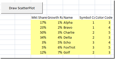
Once you have your data, simply select the entire range, all 5 columns of it, not including the headers, and click the “Generate ScatterPlot” button – et voila!