Prototype your app with Sketchflow
01 Aug 2009Even though I develop with WPF, I haven’t really used Blend so far: as of now, I am simply more comfortable working directly with xaml in Visual Studio. However, I was intrigued when I recently heard that the upcoming Microsoft Blend 3 version came with Sketchflow, a UI prototyping tool, so I downloaded the trial version and gave it a quick spin.
I spent about one hour playing with it, barely enough to give it justice (especially so when you practice the mantra “user manuals and tutorial are for wimps”), but I really liked what I saw. Sketchflow allows you to
- Rapidly design screens using Blend, adding real WPF control and defining the flow between screens based on user actions on the controls
- Build the prototype so that another person can run it and experience interacting with the application,
- Collect feedback on the prototype.
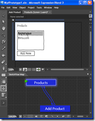
I created a simple application, where a user can view a list of products, and add new products. This is how Sketchflow looks: the top part displays your screen, the bottom the flow between the existing screens. To edit your prototype, you simply add and format controls, and define which screen they lead to if need be.
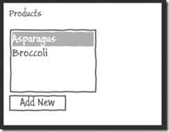
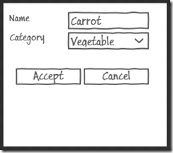
Once the prototype is built, the user can run it; the controls “work” (you can select items in the list box, press the button…), and it looks like this:
What did I like about it?
Every developer has to show their clients prototypes at some point, to give them a sense of what they will get for their money, or to discuss the application functionality. So far, I had no good solution for this. I have tried 4 things: Visio, Visual Studio, PowerPoint, and plain paper, and all of them have their limits.
- Sketchflow uses the same controls and tools you use as a developer. You can edit the properties of the controls as you would normally, every control you would want to use is available, and the familiar alignment features are all there. This is a big improvement over Visio, which had only some standard controls (and a truly weird user interface), or PowerPoint.
- You can design your prototype in sketch style (shown above), or in any style. This gives you the choice to either produce a simple UI, focused on the functionality without getting distracted by “the looks”, or a cool, snazzy looking prototype if you want to impress the client.
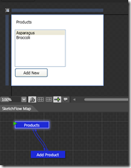
- You can add mock data to your prototype without having to build an elaborate object model (for instance, you can directly add items to the combo box). This is an improvement over building a simplified app directly using Visual Studio.
- You get a real, running prototype, which provides a much better sense for the overall flow of the application than a static paper version.
I really like the philosophy of Sketchflow. After watching the demo at Mix09, I am curious to try out some of the other features, like using the Sketchflow prototype to gather feedback from users running it. What I am wondering is whether I will end using it rather than plain paper sketches. For all its limits, a paper sketch is very fast to produce, completely free-form, and I found it a powerful way to convey my thoughts and discuss functionality. Its biggest limits are maintenance over time (modifying a sketch is pretty much impossible), and its format which makes it hard to share or present. On the other hand, these have not been real issues for me so far, as the sketches usually serve as live discussion material with users, followed very quickly by a real implementation which makes the sketch obsolete. Maybe as I get more comfortable with Blend, I will try to use it in a live design discussion and see if this is informal enough to not hinder the discussion itself!
