Movement is relative
29 Sep 2009I had an Eureka moment today, and realized that I was trying hard to resolve the wrong problem, when what was needed was a change of frame.
I have been developing an application which tracks differences between Excel worksheets, and displays them in a layout similar to Excel itself. The user can navigate through the sheet on display by using two scrollbars, just like he would with Excel. To achieve this, my approach so far has been to read the data, create a grid using WPF, adding one cell control to the grid for each cell in the spreadsheet, and navigate “over” that grid using the scroll bars.

This approach works well as long as the spreadsheet is small, but for larger sheets – say, 200 x 200 cells - the time needed to create the cells and add them to the grid was getting pretty long, so I focused my attention on figuring out a way to populate the grid faster, without much success.
Then yesterday, someone wrote this on StackOverflow:
I’m going to go out on a limb here and say that trying to add 40,000 controls is your real bottleneck; not so much as to how you’re adding the controls.
Indeed – that’s completely correct.This didn’t answer my issue directly, but it has been liberating, and got me to rethink the question from a different angle – do I really need 40,000 cells?
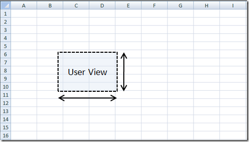
The answer is no: I just need controls for the cells which are currently on screen. Rather than compute a graphical representation for the entire spreadsheet, and then display only a small portion of it, I can create just enough cells to cover the visible area, and dynamically update their content to display the content of the visible cells. The cells you see are always the same, only their content gets updated (In hindsight, I looked back at Excel, and I believe that’s how it works). The grid contains a fixed number of cells, independent of the size of the worksheet, and should eliminate the problem altogether.

In a way, this is a small change of perspective. When you take a few steps forward, you can describe it two ways. You are moving forward, relative to the world, or you are immobile and the entire world is moving around you. Both descriptions are correct, but one comes more naturally than the other. My initial representation was similar to moving the whole entire world around the user, whereas the new approach is to simply determine what the user is seeing, and not worry about the world. Why did it take me so long to accept that I should change my design? In large part, it’s due to the fact that the old design, while not scaling well, did work – and it took me a lot of work to get it to where it is now. I had to go through a few stages of design grief (denial: “What problem? Let’s not go into premature optimization”…), before reaching acceptance – it was a nice design, but it just didn’t fit the problem, so it’s time to let go, call it a proof-of-concept, and restart from fresh with a new design that won’t hold me back! Back to the drawing board…
