Docking WPF controls in the VSTO Task Pane
16 Jan 2011One of my favorite features in VSTO is the custom task pane. It provides a very natural and unobtrusive mechanism to expose your add-in functionality, fully integrated into Office, and makes it possible to use WPF for user interface development.

However, the Task Pane is not natively a WPF control. When you create your own Custom Task Pane, you pass it a good-old WinForms control, which will then be displayed in the Task Pane. You can then add two Russian dolls to the construction: an ElementHost control inside your WinForms control (found in the WPF Interoperability section of the ToolBox), and a WPF control inside the ElementHost. At that point, your TaskPane is WPF-ready, and you can happily begin adding shiny WPF controls to your Task Pane and forget about WinForms.
If you want your Task Pane to look seamless to your user, you will probably need to play a bit with Docking. If not, two specific issues could arise:
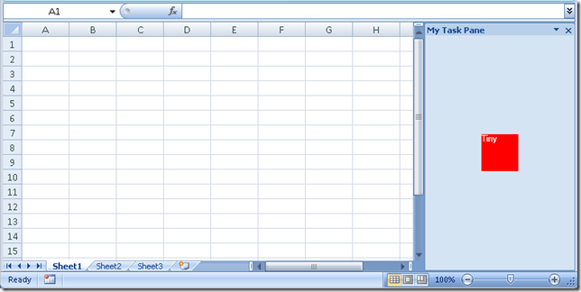
- Your WPF control is fairly small, and doesn’t take all the surface of the Task Pane, leaving the original WinForms color background visible in the uncovered areas,
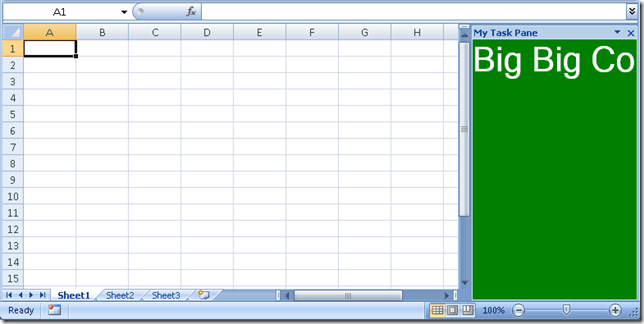
- Your WPF control is too large for the Task Pane surface, leaving parts of the control invisible to the user, who cannot access them.
The first situation is mostly aesthetics (it just looks ugly), but the second case is a bit problematic, as it could make your Task Pane virtually unusable.
To illustrate the issue, let’s create an Excel 2007 Add-In project “AddInLab” in Visual Studio, add a WinForms control TaskPaneWpfHostControl, drop an ElementHost control in there, which we rename to wpfElementHost, instead of elementHost1, and set its Dock property to Fill so that it takes up the entire surface of the control. We’ll edit the code-behind, to provide access to the ElementHost via a public property:
namespace AddInLab
{
   using System.Windows.Forms;
   using System.Windows.Forms.Integration;

   public partial class TaskPaneWpfControlHost : UserControl
   {
      public TaskPaneWpfControlHost()
      {
         InitializeComponent();
      }

      public ElementHost WpfElementHost
      {
         get
         {
            return this.wpfElementHost;
         }
      }
   }
}
Now let’s add two preposterous WPF controls in our project, SmallWpfControl (a 50 by 50 red square), and BigWpfControl (a 1000 by 1000 green square):
<UserControl x:Class="AddInLab.SmallWpfControl"
             xmlns="http://schemas.microsoft.com/winfx/2006/xaml/presentation"
             xmlns:x="http://schemas.microsoft.com/winfx/2006/xaml"
             xmlns:mc="http://schemas.openxmlformats.org/markup-compatibility/2006"
             xmlns:d="http://schemas.microsoft.com/expression/blend/2008"
             mc:Ignorable="d"
             d:DesignHeight="300" d:DesignWidth="300">
    <Grid Width="50" Height="50" Background="Red">
      <TextBlock Text="Tiny" Foreground="White"/>
   </Grid>
</UserControl>
<UserControl x:Class="AddInLab.BigWpfControl"
             xmlns="http://schemas.microsoft.com/winfx/2006/xaml/presentation"
             xmlns:x="http://schemas.microsoft.com/winfx/2006/xaml"
             xmlns:mc="http://schemas.openxmlformats.org/markup-compatibility/2006"
             xmlns:d="http://schemas.microsoft.com/expression/blend/2008"
             mc:Ignorable="d"
             d:DesignHeight="300" d:DesignWidth="300">
    <Grid Height="1000" Width="1000" Background="Green">
      <TextBlock FontSize="42" Text="Big Big Control" Foreground="White"/>
   </Grid>
</UserControl>
In the add-in start-up method, we can now create a task pane, and add the SmallWpfControl to it, like this:
public partial class ThisAddIn
{
   private void ThisAddIn_Startup(object sender, System.EventArgs e)
   {
      var wpfHost = new TaskPaneWpfControlHost();
      var wpfControl = new SmallWpfControl();
      wpfHost.WpfElementHost.HostContainer.Children.Add(wpfControl);
      var taskPane = this.CustomTaskPanes.Add(wpfHost, "My Task Pane");
      taskPane.Visible = true;
   }
   // rest of the code omitted
}
Running this code produces the following result:

Replacing with the big control produces an even less satisfying result:

So how can we address that issue?
We would like to see two things happen:
-
The entire surface of the Task Pane should be covered by a WPF control,
-
If our WPF control is too large, we should have scroll bars allowing us to navigate over the entire surface of the control.
To achieve that result, we will add another Matrioshka to the collection, and create a new WPF control responsible for the layout: it will occupy all the space available, and display scroll bars when they are needed. That control, TaskPaneWpfControl, contains three WPF controls:
-
a
ScrollViewer, with the two ScrollBars set to Auto. The purpose of this control is to display automatically scrollbars if the size of the contents exceed the surface available. The cool thing about this is that if scrollbars are not needed, they won’t be displayed at all, leaving the entire surface available, -
a
DockPanel, which will expand to fill the entire surface it has available, -
a
StackPanel, which will display WPF controls stacked from the top of the Task Pane.
<UserControl x:Class="AddInLab.TaskPaneWpfControl"
             xmlns="http://schemas.microsoft.com/winfx/2006/xaml/presentation"
             xmlns:x="http://schemas.microsoft.com/winfx/2006/xaml"
             xmlns:mc="http://schemas.openxmlformats.org/markup-compatibility/2006"
             xmlns:d="http://schemas.microsoft.com/expression/blend/2008"
             mc:Ignorable="d"
             d:DesignHeight="300" d:DesignWidth="300">
   <ScrollViewer
         HorizontalScrollBarVisibility="Auto"
         VerticalScrollBarVisibility="Auto">
      <DockPanel Background="Yellow">
         <StackPanel x:Name="TaskPaneContent"/>
      </DockPanel>
   </ScrollViewer>
</UserControl>
We can now modify our add-in start-up code to use our new control:
private void ThisAddIn_Startup(object sender, System.EventArgs e)
{
   var wpfHost = new TaskPaneWpfControlHost();
   var wpfTaskPane = new TaskPaneWpfControl();
   var wpfControl = new SmallWpfControl();
   wpfTaskPane.TaskPaneContent.Children.Add(wpfControl);
   wpfHost.WpfElementHost.HostContainer.Children.Add(wpfTaskPane);
   var taskPane = this.CustomTaskPanes.Add(wpfHost, "My Task Pane");
   taskPane.Visible = true;
}
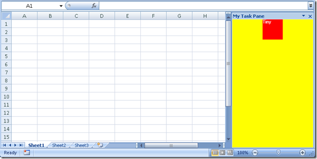
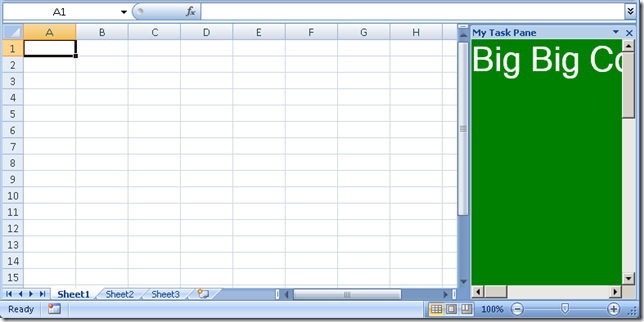
When using our two existing controls, we now get the following:


The result is fairly ugly, but proves the point. In the first case, the surface in the TaskPane that is not used by the Tiny Control is a repulsive Yellow, coming from our new control, and demonstrating that the WinForms host is now totally covered – and there are no scrollbars in sight. The second case shows that we now have 2 nice scroll bars available, enabling our user to navigate the entire surface of the Task Pane.
I’ll leave to you to find more attractive color palettes than the one used in the example, which shouldn’t be too difficult, but hey, I am color blind – I have an excuse!
