Transform a picture in the style of Mondrian with F#
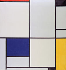
16 Mar 2013Mondrian is one of those modern painters whose work everyone recognizes, even though few people will quote his name. He also happens to be one of my favorite artists - in spite of their simple geometric structure, I find his pieces strangely beautiful:

‘Tableau I’, from Wikipedia
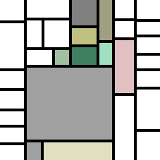
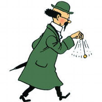
I have been hard at work on some pretty dry stuff lately, and needed a bit of a change of pace, and ended up spending a couple of hours coding a simple Mondrianizer in F#: give it a picture, and it will transform it into something ‘in the style of Mondrian’.
For instance, starting from my Twitter avatar, here is what the Mondrianizer produces:


This was strictly quick-and-dirty hackery, so the code is not my best by any stretch of the imagination, but I was rather pleased by the results - you can find the current version of the Mondrianizer here on GitHub.
The approach
I won’t comment the code line-by-line - I will simply outline the overall approach instead.
On a very simplistic level, two elements are characteristic of Mondrian paintings: the division into rectangles surrounded by a black border, and simple, high-contrast colors with a lot of white.
The approach I took was to proceed recursively, and divide the surface of the initial image into rectangles. Starting for the initial rectangle, I cut it into 2 rectangles, then pick one of the two rectangles at random and split it, then pick one of the 3 rectangles and split it, and so on until I reach a certain depth level.
How are the rectangles divided? Given a rectangle, I wanted the split to create as much color contrast as possible. In order to do that, the algorithm generates a couple of random splits, measures the ‘average’ color on each side (the average Red, Green and Blue), and picks the split with highest color distance. To avoid expensive computations, rather than computing the average over the entire pixel set, a random sample of pixels is taken from each side. Once the image is broken down into ‘Boxes’ (rectangles which completely cover it), the final rendering begins, with 2 steps: colorization, and ‘borderization’. The boxes closest to white are painted pure white, whereas the others are painted with a ‘rounded’ color (we round the average Red, Gred and Blue to the closest multiple of 32), to obtain an overall simplified palette. Finally, a black border is painted around each box, except for the outer edges of the image.
Comments and flaws
Let’s start with the flaws. The current colorization is very inefficient - it paints each pixel one by one, whereas I believe using Rectangles and Brushes should allow for some speed-up, especially for larger images. You are warned - if you Mondrianize your entire high-def vacation pictures for that extra touch of Neo-Plasticism, it might be a good time to take a coffee break.
I don’t really like how the Random instance is passed around everywhere, and I think it could be removed altogether, with a bit of work. The obvious place where it should be removed is in the ‘average’ function, which computes the average color of a box: rather than sampling random pixels, a deterministic approach, polling pixels at regular interval, would work just fine.
Now to some comments. From what I can see, the resulting colors are either white or rather dark (which makes sense given the approach taken to determine white boxes), and not that ‘primary’. I suspect that a rebalancing of the final colors towards lighter shades might be better. I also suspect that different measure functions might give better results - for instance, splitting across the largest single primary color difference (instead of overall distance) might result in more color contrast. That’s all coming from a color-blind person, so I may be entirely wrong here! In general, it would be nice to inject all the color-analysis metrics as functions in the algorithm. The piece which got me thinking the most was the top-down division process. This blog post presents an approach which is much closer, in my opinion, to the way the partitioning is constructed in a real Mondrian: it draws a partitioning line between two edges, which might span multiple boxes. This other blog post discusses algorithms based on tiling, and interestingly enough, the first figure it depicts could never be obtained by either the approach mentioned above or mine.
I ended up going the route of the top-down descent splitting individual boxes, because determining splits based on color across multiple boxes simultaneously sounded like way too much effort for what I was trying to achieve - and unlike the other approaches mentioned, I wasn’t constructing an image from scratch, but rather rearranging an existing image based on its color organization.
Finally, note that fundamentally, the algorithm I implemented here is a crude clustering algorithm - take a population of pixels, and try to break it into groups as different as possible.
That’s it for today - I’ll probably revisit this code at some point, but it served its purpose of distracting me for now. Let me know if you have comments or questions!
Additional links and resources
- Piet Mondrian on Wikipedia
- An interesting post on how to break an image into Mondrian-style rectangles.
- MyData = MyMondrian, an intriguing project which creates a Mondrian-style figure, based on your personal data.
- Truchet and Mondrian, a great post on tiles and patterns construction algorithms.
